In May 2021, we launched Stax, a universal money app developed by Hover Developer Services, Inc. (Hover) to enable users across Africa to access their bank accounts and mobile wallets in one place without using mobile data. Our primary reason for building the product was to ensure two things - Access and Choice. Of course, so much has changed since the first day we launched the product, but our stand on “Access” and “Choice” have not.
The product has evolved. The team and user base have expanded, and so have our minds. Yet, our mission is still consistent - we want to build an inclusive internet, a world where Africans can access their money with convenience. We have learned more about the brand and our users in recent months. We have evolved. And with evolution, change is expected.
What has changed?
- Our vision
- The visual identity
- The tone
- The website
- The look and feel of the app
Having served thousands of users in our first phase, there was the need to overhaul the visual brand, website, and mobile app to deliver a better experience and intentionally capture the brand’s identity and values.
Our Vision:
When we first launched, we adopted the vision of our parent company, Hover, which was to empower developers with resources, services, and tools to build for local communities at global scale. However, a new vision was necessary with the pivot to Stax and the evolution of our product and our offerings. Our new vision is to make financial freedom accessible. We are already living this vision, and in many ways, it is not a change but a manifestation of our values and brand promise.
Our visual identity:
This rebrand was focused on our visual identity, as it was an effort to reflect and manifest our values and the expectations of our users. In the early days of building Stax, we placed on your product and its capability to earn its place within the industry and deliver on functional promises. We’ve learned more about how important trust, ease, simplicity, and security are to us and our users, and we’re expressing this with our brand new identity. Now we want to deliver on both the functional and emotional promise.
Stax has always been about the dignity of choice, access, and financial freedom. This comes across in our personality. We represent ideals of a good work ethic, honesty, and authenticity. We respect the dignity of each individual, regardless of differences. Mutual trust, simplicity, ease, and security are the foundations we have built on. This rebrand is heavily built on these pillars. Our drive to provide effortless access without compromising trust and security is the foundation of our identity. We maintained some elements from the previous identity and heightened or introduced other elements to reflect these pillars. They formed the foundation of every design choice, from the logo to the color, to the friendly type, illustrative style, patterns, etc.
Logo:
One of the critical representations of our identity is our logo. Our new and improved logo is an upgraded version of the previous logo with a monochrome spin. Trust, simplicity, and security are inherent in the logo icon and logo mark.
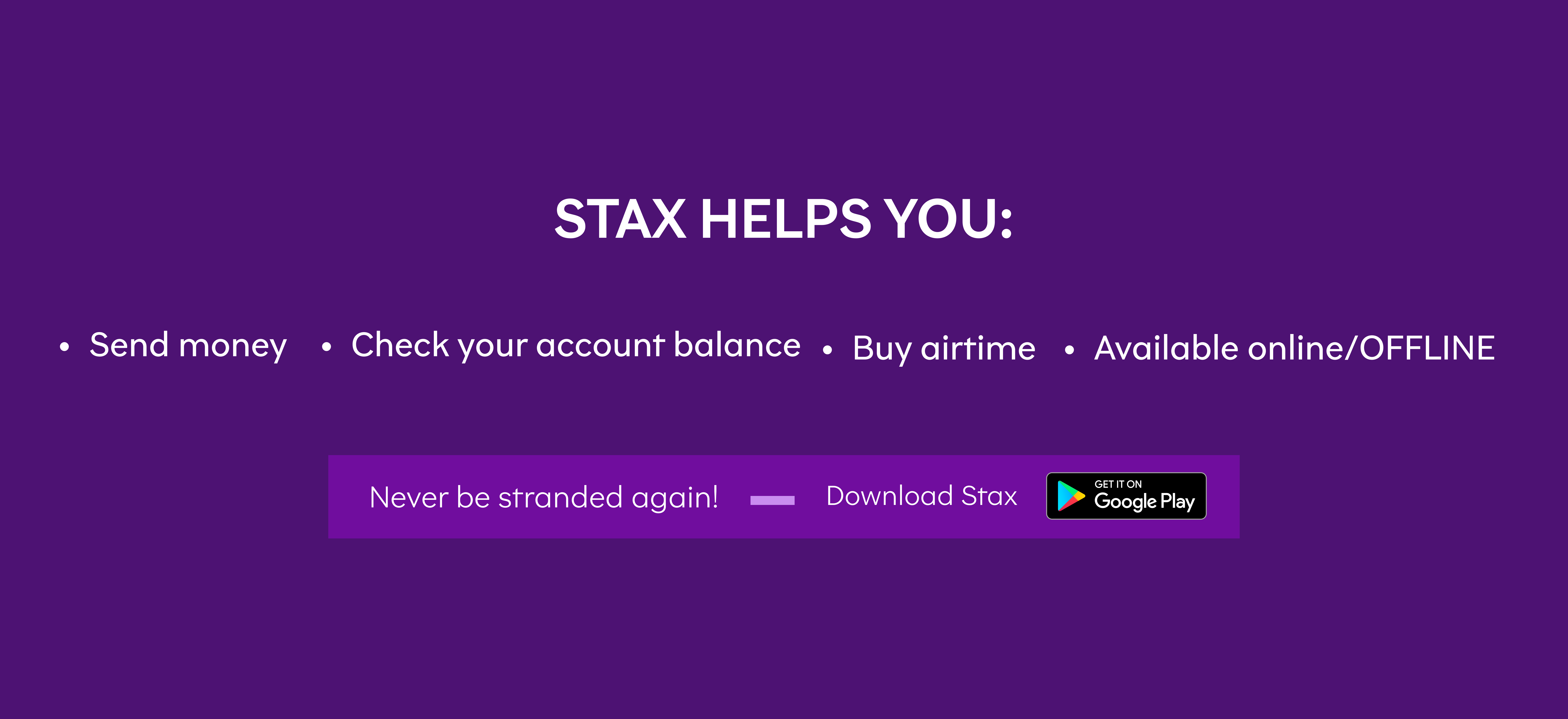
Our logo combines our icon and a word mark of our name. Our name Stax was inspired by “stacks of cash” because we wanted to represent and mimic the behaviour of cash. Cash doesn’t wait for you to be online to work. When cash is in your hand, you feel like you have control, and you do because no one debits you for maintaining the cash in your hand or charges you an extra percentage when you pay your cash. Transaction costs are almost free. That’s the kind of value Stax gives you. It gives you the “e-cash” feeling: more control of your money online and offline. We work offline, and we work like cash but with the ability to be cashless in an offline kind of way. This inspired the 3 bars on the left, an original idea by a Stax community member. We maintained that element and shaped it into an angular S to represent the S of Stax.
Color
The primary brand color is blue. We retained the main blue color but tweaked it to a different shade to embody a new meaning. This shade of blue reinforces community, security, trust, ease, and safety. We expanded the color palette to include black, white, and shades of green to reinforce transparency, authority, openness, and growth. In addition, we had multiple and deliberate vibrant colors to express our personality, friendliness, relatability, and innovation.
Our color tone is monochrome. Monochrome emphasizes simplicity and trust and has more leverage and functional applications. The new monochrome gives more room for usage and aligns with trust, simplicity, and ease.

Typography
Our new typeface family is Brutalista. Typography is an essential pillar in our identity because words have a voice, and fonts make up the tone of that voice. We moved from Effra to Brutalista to reinforce our personality. Our Primary typeface is called Brutalista, and Brutalista alternate. It comprises six different weights in its family. Brutalista will be used for Headers, and Brutalista alternate for subheaders. It is friendly, easy to read, and has personality.
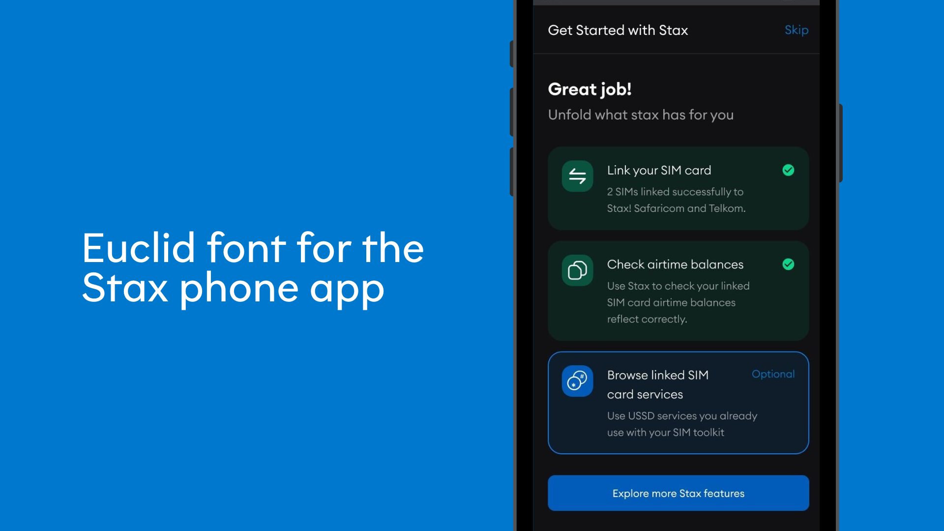
Our secondary typeface is Euclid. We chose this typeface because of its close similarity to Brutalista alt. Accessibility is crucial to us, and as we expand to more countries, the words in our app will need to be converted to other languages. To support more languages and for accessibility, we chose this sans typeface. It supports over 400 languages and comprises five collections: Euclid Circular A. In Euclid Circular, the circle measures all things: Letters with stems and bowls – think ‘a’, ‘b’ or ‘p’ – have immaculate round counters, punctuation marks are based on circular dots, ‘G’ is round up to the bar. The defining feature of Euclid Circular A is its horizontal terminals: Curves are cut parallel to the baseline. See ‘S’ or ‘3’. The result is a self-confident Geometric Sans of timeless beauty. Euclid Circular A can be seen as ideological. The goal is to ensure that every country we expand to can enjoy Stax without altering the look, feel, and experience. This typeface will only be used in-app.
The tone:
Our tone is shifting from a tech-heavy tone to a simpler, empathetic, and more relatable tone. We want to ensure our users feel seen and heard. We are moving from a product-focused tone to a more community-focused tone. Inclusion and community go hand in hand. Our goal is to connect more with our users and build a community of people who care about their money and financial growth and want to be in control of their lives and money. Beyond a product, we are building a safe space for our users to share their challenges with us and, in many ways, build with us. To do this, we are maintaining a simple demeanour and tone that communicates clearly, impacts knowledge with empathy, is inclusive, and cares about the growth and success of our users. We are also shedding the excesses and keeping only what is necessary. We are embracing a clutter-free design style to focus on what is truly important.
The website
To embody our community-focused direction, a landing page is no longer sufficient. We have outgrown it. We have built a new website that reflects the kind of brand Stax has grown into. The most important parts for us were improving the user experience and having a refreshing look with simplicity and infusion of our new visual system to give an overall satisfying feel. In addition, we have added a blog feature to share more with you. The blog will feed the users with updates on the product, company, educational content, users generated content and more. Beyond that, we share thoughts and discoveries. Take a tour of the new website here.
We have also introduced an alternate website called ussd.directory. We created this website to help you find USSD codes across Africa. We have thousands of entries across mobile network operators, banks, telcos, industries, and utilities. As you probably know, we started Hover Developer Services, Inc. (“Hover”) because of a technical innovation that allowed us to run USSD (Unstructured Supplementary Service Data) sessions in the background of an Android app. Hover helps developers automate USSD sessions in the background of Android applications. Stax is built on this USSD technology. So, we created this website as a handy guide to everything you need to know about USSD codes. The platform makes it easy to find the USSD codes you’re looking for on your mobile phone, selected from various categories, including banking, telecoms, utilities and industries. You’ll find USSD codes + appropriate descriptions, references/tips on how to use them, and other applications of USSD you probably never knew about. Visit the website here.
The Look and Feel of the App
We are also changing how the app looks and feels to reflect the new visual identity and give users a unique experience. You will notice these changes when you update your app. This change is gradual, and our Head of Product, Jess Shorland, will talk more about this in a separate post. But this change is massive. Plus, a little birdie told me crypto is coming to Stax. You’ll hear more about that in a few weeks.
Don’t miss our Twitter Space, where we’ll discuss this rebrand more. Set a reminder by clicking the link below. We hope you come and ask us your questions and share your thoughts.
These changes are proof of growth and should be embraced, as it is something we should all be proud of. To reflect this growth and change, we rebranded. This rebrand is not about us alone; it is also about you. We (Stax) will continue to do what we can to provide people in Africa with ACCESS and CHOICE regarding their money. That’s the beauty of financial inclusion.
This rebrand was a team effort.
- Visual rebrand led by in-house Designer Akinsehinde Itunuoluwa, TheSabiDesigner
- Motion Graphics by: New Native Studio
- Brand Strategy by: Blessing Abeng
- Website UI design by: Kingsley Iheonye
- Website development by: Motunrayo Dacosta and Samuel Ralak
- USSD content by: Orachi Onubedo
- Vision and Strategic Direction by: Founders (Ben Lyon, Jess Shorland, and David Kutalek)
- App development, reliability and growth by: Oluwatobi Akinpelu, Steve Chikwiri, Nwachukwu Ossai, John Swekenyi, Alex Kombo, Peace Itimi, and of course, every single contribution made by our users brought us to this moment.
In all, we are putting you front and center, in line with our values. In many ways, we are being an ally to our users and designing for accessibility and inclusion. I hope you love the new brand and the new energy it brings.
PS: This is our launch week, kindly engage, like, love, retweet etc.
Yours by Design,
Akinsehinde Itunuoluwa Ayanfe (@theSabiDesigner).
Cheers to more great work ahead!
Please share this article